1. The man, Han, was killed after being pushed into the subway track and was not strong enough to lift himself up. The photographer was present at the scene and after determining that he would not be able to save the man, he captured photos of the event instead.
2. The photographer said that he took the photo so that the conductor would see his flash and stop.
3. I think that it is important that photos like these should be taken, but not if a life could have potentially been saved.
4. I think that as a photographer, he did what was instinct to him. If he was truly unable to help the man, then photos are sadly more valuable.
5. I think that this photo makes a dynamic cover page, but is extremely disturbing for many people who disagree with this type of journalism.
6. Photojournalists have a passion for capturing moments of life as they happen at the cost of a few deaths. Although this is extremely unsettling, it is their instinct and contribution to the world.
7. I think that a photojournalist should always use their judgement before choosing if they should involve themselves in the situation or take photos. If they could potentially help someone or save a life, photos are not the priority. If a situation is hopeless, photos might as well be taken.
8. Photojournalists should always avoid influencing the events that they photograph. If they were to do this, the event would not be authentic, but posed for a camera.
9. The best response is exactly what Abbasi said. There was no way that he could have save the man, so he helped in the way that he could, which was to take photos.
Monday, December 19, 2016
Monday, December 12, 2016
Final Exam Review
Writing Captions
1.
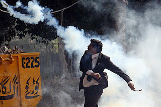
On October 27th in the upper east side of Philadelphia, James Ramsey escapes his burning apartment complex is order to survive. According to many of the residents, the building had a history of catching fire due to electrical wire.
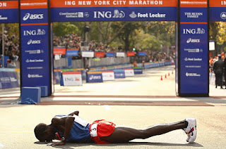
After winning the New York City Marathon on September 2nd, Kenyan runner kisses the ground to show his gratefulness for his victory. In addition to his win, the runner set a new personal record.
Rules of Photography
1. Rules of Thirds- placing a subject off center, vertically or horizontally
2. Balancing Elements- placing subjects within frame so that they are equal in visual weight
3. Leading Lines- using lines to attract a viewers eye to the subject
4. Repetition-repeating visual elements to create rhythm and unify the elements of the photo
5. Viewpoint- making the photo more dynamic by approaching the subject at multiple angles
6. Background-making the background of the photo simple to draw more attention to the subject
7. Create Depth- amount of distance between photographer and subject. Tools are background and foreground.
8. Framing-placing a subject in a frame in order to focus attention on it
9. Cropping-leaving unimportant details of a photo out of the frame and focusing on one specific aspect of the photo
10.Mergers + Avoiding Them- when a part of the photo clashes with something else in the picture, distracting from the subject. To avoid this, arrange the subject in another way.
1.

On October 27th in the upper east side of Philadelphia, James Ramsey escapes his burning apartment complex is order to survive. According to many of the residents, the building had a history of catching fire due to electrical wire.

After winning the New York City Marathon on September 2nd, Kenyan runner kisses the ground to show his gratefulness for his victory. In addition to his win, the runner set a new personal record.
Rules of Photography
1. Rules of Thirds- placing a subject off center, vertically or horizontally
2. Balancing Elements- placing subjects within frame so that they are equal in visual weight
3. Leading Lines- using lines to attract a viewers eye to the subject
4. Repetition-repeating visual elements to create rhythm and unify the elements of the photo
5. Viewpoint- making the photo more dynamic by approaching the subject at multiple angles
6. Background-making the background of the photo simple to draw more attention to the subject
7. Create Depth- amount of distance between photographer and subject. Tools are background and foreground.
8. Framing-placing a subject in a frame in order to focus attention on it
9. Cropping-leaving unimportant details of a photo out of the frame and focusing on one specific aspect of the photo
10.Mergers + Avoiding Them- when a part of the photo clashes with something else in the picture, distracting from the subject. To avoid this, arrange the subject in another way.
Friday, December 9, 2016
Monday, December 5, 2016
Wednesday, November 30, 2016
Monday, November 28, 2016
100 Photos of All Time
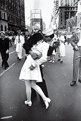
V-J Day in Times Square by Alfred Eisenstaedt
1. I chose this image because it resonated with me in a way that made me feel happy and want to know more about the picture.
2. This photo was taken at Times Square at the end of World War II in 1945. Eisenstaedt was hired by LIFE magazine and made it his personal mission to "find and catch the storytelling moment," leading him to Times Square where this photo was taken.
3. In addition to this photo, additional photos of the ending of World War II gave more information about the time period that the photo was taken.
4.
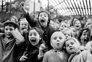
5.
Alfred Eisenstaedt
Born: December 6, 1898 Death: August 23, 1995
Born in Tczew, Poland
Attended Humboldt University of Berlin
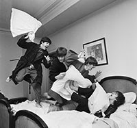
The Pillow Fight by Harry Benson
1. I chose this photo because I liked how it captured this action and emotion.
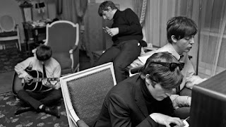
2. This photo was taken at the George V Hotel of the Beatles the night that they each discovered that "I Want to Hold Your Hand" hit No. 1 in the US. Originally, Harry Benson was upset to hear that he would be covering the Beatles and felt that he was a more respected journalist than a rock and roll writer. After meeting the band, he was grateful that this was the job assigned to him and that it changed his life in many ways.
3. In addition to the actual photo, I learned from a video provided about details of the story behind the pillow fight.
4.
5.
Harry Benson
Born: December 2, 1929 Death: 1953
Born in Glasgow, United Kingdom
School attended: not found
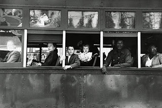
Trolley-New Orleans by Robert Frank
1. I chose this photo because I enjoy how it captured emotion.
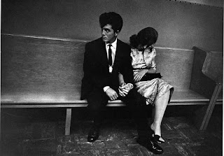
2. This picture is significant because it was taken a few weeks before Rosa Parks refused to give up her seat in Alabama. It represents the irony existing in America during this time.
3. no additional information
4.
5.
Robert Frank
Born: November 9, 1924 Death: not applicable
Born in Zurich, Switzerland
School attended: not found
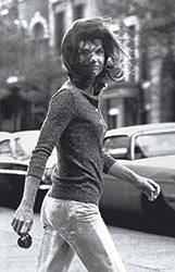
Windblown Jackie by Ron Galella
1. I chose this photo because I like how the photo captured this woman the moment before she recognized that she was being photographed.
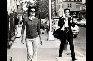
2. This photo was taken due to Ron Galella's obsession with photographing Jacqueline Kennedy Onassis. Many were fascinated with photographing her, especially after her husband, John Kennedy, died.
3. The video provided along with the information about the photo gave viewers insight on Galella's opinion behind his career as a photographer and his journey leading up to "Windblown Jackie."
4.
5.
Ron Galella
Born: January 10, 1931 Death: not applicable
Born in The Bronx, New York City
School attended: Art Center College of Design
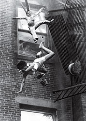
Fire Escape Collapse by Stanley Forman
1. I chose this picture because it made me feel sympathy for the mother and goddaughter falling from the fire escape.
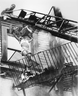
2. This picture was taken the day that Forman got a call about a fire on Marlborough Street. He figured it was a routine fire rescue, however after a fire escape gave way leaving a mother and goddaughter falling to the ground, Forman took a picture that would change his life.
3.no additional information
4.
5.
Stanley Forman
Birth: July 10, 1945 Death:not applicable
Born in Winthrop MA
School attended: Benjamin Franklin Institute of Technology
Thursday, November 17, 2016
Fashion Photography
1.
-enlarged lips
-lengthened neck
-lowered eyebrows
-thickened hair
-slimmed face
-enlarged eyes
-toned face
2. lighter skin, fuller lips, evened out nose, bigger eyes, shoulder moved up, skin glow, thinner arm, thinner stomach, thinner back, smaller boobs, longer thighs, smaller feet, thinner legs, taller legs, longer neck, thinner face, thinner neck, highlighted face, lighter hair, lighter skin, etc.
3. smaller butt, smaller legs, smaller arms, wrinkles removed, thinner back, thinner waste, cleaned up armpit, boobs altered smaller, face made slimmer, more hair, etc.
4. It is not ethically acceptable to change a person's appearance like these in a photo because it alters an audience's perception of reality and beauty.
5. There are circumstances where manipulations such as these are more ethically acceptable, but not in this sense of advertising. Some examples of these exceptions are for the purposes of art, irony, and etc.
6. Changes such as levels and cropping are completely acceptable, along with changes that help to restore the original environment that the picture was taken in. In advertising, I believe that changes such as those previously listed are acceptable along with other softcore manipulations in Photoshop.
7. Fashion photography and photojournalism differ in many ways. Fashion photography is heavily manipulated in order to make an audience perceive perfection. On the other hand, photojournalism is minimally manipulated in order to show an audience the truth.
8. Fashion photography has little to no relationship with reality while photojournalism is based on reality. I believe that the ethical practice of fashion photography should come much closer to the median between reality and dreams while photojournalism is at a comfortable point and should maintain it's current relationship with reality.
9. I think that these three videos are being shown to us to widen our knowledge of the power of photo manipulation so that we have a more complete opinion of it and how it relates to our work in photojournalism.
10. None of these videos are about guys because it is less common for men to be exploited the way that women typically are in advertisement.
Wednesday, November 16, 2016
5 Websites
Photos everyone should know how to make:
http://petapixel.com/2014/12/01/6-types-photos-know-make/
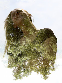
The website discussed useful tricks for taking intermediate level photos. Some types of photos discussed were fake tilt and shift, forced perspective, long exposure landscape, digital infrared, double exposure portrait, and 360 degree polar panorama photos. Some tricks were a matter of camera settings while some regarded photoshop or equipment.
I chose this photo because I liked the double exposure tactic it used and what I felt like the photo represents. Some rules of photography used are viewpoint and simplicity. The photographer of this photo isn't provided.
Spiral Staircases
http://petapixel.com/2014/12/19/disorienting-beauty-spiral-staircases-old-abandoned-buildings/
(the photo I chose is the last photo provided on the site)
This website examines a selection of photos called "Abandoned Staircases." A photographer travels across Europe to explore abandoned buildings and photograph the staircases.
I chose this photo because I like the depth in it and the vibe that it gives off. Some rules of photographh used in this photo are depth and possibly viewpoint. Christian Richter took this photo.
Great Portraits
http://blog.phowd.com/2014/09/7-tips-shooting-great-portrait-photographs/
(the photo I chose to post is the second on the site)
This site guides photographers to think outside of the box while shooting portraits. Some tips were to break the ice with the subject, exit the subject's comfort zone, direct the subject to look off camera, take advantage of negative space, break the rules of photography, and to tilt the horizon line.
I picked this photo because I appreciate how it used two of the tips provided on the site: gaze directed off camera and taking advantage of negative space. A rule of photography in this photo is rule of thirds. The photographer of this photo isn't provided.
Style
http://petapixel.com/2014/08/25/approaching-problem-style/
(the photo I chose to post is the first photo provided on the site)
This site guides photographers on how to develop a personal photography style. One thing that the site says is that the excercises that are being discussed will not develop your style, but give you thr muscles to develop it.
I picked this photo because I enjoy how the subject was not looking at the camera and the depth that the staircase added to the photo. Some rules of photography in this photo are depth and rule of thirds. The photographer is unknown.
Killer Timelapse
http://blog.ted.com/how-to-create-a-killer-timelapse-with-joe-capra/
This site features an interview with Joe Capra about his work with timelapse. It featured a video that he has taken.
The time lapse is of different locations in Rio de Janeiro made by Joe Capra. He was inspired by Tom Lowe. I learned the process of setting up a time lapse and how to pace different time lapses.
http://petapixel.com/2014/12/01/6-types-photos-know-make/

The website discussed useful tricks for taking intermediate level photos. Some types of photos discussed were fake tilt and shift, forced perspective, long exposure landscape, digital infrared, double exposure portrait, and 360 degree polar panorama photos. Some tricks were a matter of camera settings while some regarded photoshop or equipment.
I chose this photo because I liked the double exposure tactic it used and what I felt like the photo represents. Some rules of photography used are viewpoint and simplicity. The photographer of this photo isn't provided.
Spiral Staircases
http://petapixel.com/2014/12/19/disorienting-beauty-spiral-staircases-old-abandoned-buildings/
(the photo I chose is the last photo provided on the site)
This website examines a selection of photos called "Abandoned Staircases." A photographer travels across Europe to explore abandoned buildings and photograph the staircases.
I chose this photo because I like the depth in it and the vibe that it gives off. Some rules of photographh used in this photo are depth and possibly viewpoint. Christian Richter took this photo.
Great Portraits
http://blog.phowd.com/2014/09/7-tips-shooting-great-portrait-photographs/
(the photo I chose to post is the second on the site)
This site guides photographers to think outside of the box while shooting portraits. Some tips were to break the ice with the subject, exit the subject's comfort zone, direct the subject to look off camera, take advantage of negative space, break the rules of photography, and to tilt the horizon line.
I picked this photo because I appreciate how it used two of the tips provided on the site: gaze directed off camera and taking advantage of negative space. A rule of photography in this photo is rule of thirds. The photographer of this photo isn't provided.
Style
http://petapixel.com/2014/08/25/approaching-problem-style/
(the photo I chose to post is the first photo provided on the site)
This site guides photographers on how to develop a personal photography style. One thing that the site says is that the excercises that are being discussed will not develop your style, but give you thr muscles to develop it.
I picked this photo because I enjoy how the subject was not looking at the camera and the depth that the staircase added to the photo. Some rules of photography in this photo are depth and rule of thirds. The photographer is unknown.
Killer Timelapse
http://blog.ted.com/how-to-create-a-killer-timelapse-with-joe-capra/
This site features an interview with Joe Capra about his work with timelapse. It featured a video that he has taken.
The time lapse is of different locations in Rio de Janeiro made by Joe Capra. He was inspired by Tom Lowe. I learned the process of setting up a time lapse and how to pace different time lapses.
Monday, November 7, 2016
Magazines 2
Image Based
Image based covers are normally focused on one or a few people posing for the camera. This approach is use in almost all fashion magazines, celebrity magazines, and men's magazines. The nature of the photography has to coincide with that of the publication style.
Illustration Based
This is one of the first concepts of magazine covers. All the way from the mid 30's to the 20th century, illustrations were the only way to develop a cover. Now, illustrations are much less common and only primarily used to show something funny or unusual and draw attention to the magazine this way.
Type Based
This is another rare approach, however more prevalent than illustrated covers. They are meant to be striking or shocking and draw a reader's curiosity using this method. Often times the type says something that calls for further explanation.
Concept Based
This combines the image based, illustration based, and type based methods of cover design. They are meant to be easily understood by a viewer immediately. They are typically used in business magazines or independent magazines.
Favorite Cover
Favorite
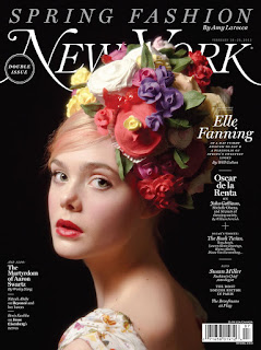
"New York’s “Spring Fashion” cover with actress Elle Fanning has artist Will Cotton revisiting Johannes Vermeer’s famous painting “Girl With a Pearl Earring” in pose, expression, and lighting, while Fanning’s Vivienne Westwood–inspired headpiece made of icing and designed by Cotton prepares readers for the stunning “Candy Land” portfolio inside the magazine. Cotton has been using candy in his artwork “as a metaphor for pure pleasure” since the late nineties, and used spring looks as inspiration for New York."
I like this cover because of the creative feel that the flowers give it. The proximity of the text is very simplistic and organized. The font type and white coloring is a common thread throughout the whole cover design, giving every word on the page a purpose and organized sense. The woman pops out from the black background, drawing attention to the cover. A tactic like this is very useful to sell more copies of your magazine. The aesthetic image makes the magazine emotionally irresistible. All of the information about the magazine and its contents are given on the cover.
Best Magazine Covers 2013
Magazine Tips
1. Do not judge your cover on a computer screen.
2. Make your cover emotionally irresistible by image appeal.
3. Arouse curiosity in your cover.
4. Make the cover interesting and intellectually stimulating to promise benefits.
5. Pose your magazine by making it seem as it is worth the money the consumer spends on it using the cover.
2. Make your cover emotionally irresistible by image appeal.
3. Arouse curiosity in your cover.
4. Make the cover interesting and intellectually stimulating to promise benefits.
5. Pose your magazine by making it seem as it is worth the money the consumer spends on it using the cover.
Friday, November 4, 2016
Self Portrait
Helpful Tips:
1. alter your perspective
2. break rules of composition
3. introduce a prop
Environmental Portraits:
1.
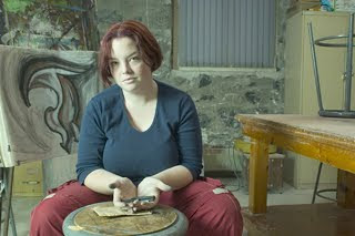
I chose this photo because I like how the objects around the artist are turned to draw attention to her and the seriousness of the picture.
2.
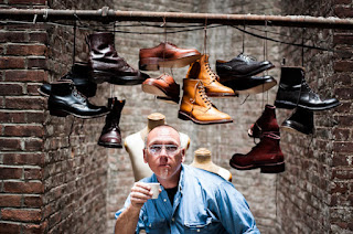
I chose this photo because I like how the photographer chose to frame the subject between the smile brick wall and introduced the shoes as a prop to frame him as well. The shoes are also what give the photo personality.
Photography Self Portrait:
1.
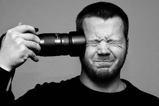
I chose this photo because I love how he use the camera to represent his passion in life, but used it to double as a gun to articulate some of his most personal emotions.
2.
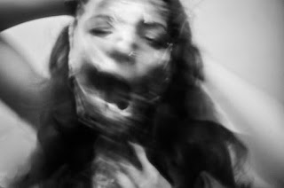
I chose this photo because I like how the photographer used the camera in an artistic way to make it look like she's being torn apart or worn away, which eerily represents a recurring sadness in her life.
Casual Portrait:
1.

I chose this photo because I like how it breaks the rules of photography. His direction in the frame makes a viewer uncomfortable which I think represents some deeper emotion within the subject.
2.
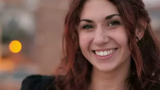
I chose this photo because I like the use of aperture.
For my portraits, I will most likely combine the three helpful tips that I posted above and take the photo in an interesting environment. I love the way my photos at Spiderhouse Cafe turn out, so I will most likely go there.
Wednesday, November 2, 2016
American Soldier
A. To me, the most powerful image from the pictures printed in the Denver Post was the photograph of Ian praying while at basic training. This is powerful because it shows us how the army is beginning to make him feel the need to turn to a greater being for help in his life, specifically his terrible heat rash.
B. The images work together to tell a story by providing viewers with a step by step "summary" of his life in the army.
C. Captions enhance the photographs by explaining to readers the events occurring in the pictures, along with events that came before or after that. It gives viewers deeper understanding of the photos of Ian.
D. Ian leaves for basic training in Georgia, saying goodbye to his friends, family, and girlfriend. He struggles with this new lifestyle along with the rest of his group, realizing how serious the army is. He proposes to his girlfriend Kayla and returns to training in a new place, called Fort Carson, which was closer to home. He an Kayla eventually break up. Ian spends a majority of his weekends home and begins to feel like he is living two lives, one at home and one in the military. His deploy to Iran was delayed because of a few of Ian's mistakes and is transferred to a new platoon and dropped in rank. Soon, Ian is deployed to Iraq. After a year, he returns home and marries his girlfriend, Devin.
E.The first sentence of the photos in which Ian is the main subject are always written in present tense, while the following sentences are in past tense.
F.
1. There are two to four sentences on average.
2.The first sentences in each caption provide information about what is happening in the photo in a form loosely related to who, what, when, where and, why.
3. The second sentences provide information about what was said at that time or events that occurred before or after the photograph was taken. In short, they provide information that cannot be observed from the photo itself.
4. The third sentence provides more details to flow with the second sentence or contain a quote.
5. Lots of the captions contain quotes.
6. There are captions containing four sentences.
G.It's possible to tell a complete story with just photos and captions because it provides a visual aspect along with details which can ed up serving as a movie of the sorts.
H. Although a story can be told using only photos and captions, stories can and should be told in a way that best suit the specific story.
Monday, October 31, 2016
Subscribe to:
Comments (Atom)


